Quick ggplot2 Tip: Left Align ggplot2 Titles, Subtitles, and Footnotes with Y-Axis Label
Override ggplot2 defaults to add a consistent left-alignment throughout your figure
Mastering the R package ggplot2
The ggplot2 package provides powerful methods to display data as
graphics. The beauty of the package lies in it’s simplicity -
understanding the core methods (applying variables to aesthetics and
transformations) covers ~95% of static visualizations a data
visualization developer might be interested in generating. Most of final
5% can be achieved by understanding the infrastructure of the package.
One such example is how plot components are “written” to the graphics
device.
I’ll walk through how titles, subtitles, and footnotes can be repositioned to align with the positioning of the y-axis label.
Let’s walk through left-aligning plot components in ggplot2.
Libraries and Data Reshaping
The midwest data set from the ggplot2 package contains demographic
information of midwest counties and should work as a representative
dummy data set for this post. Here is a quick overview of the midwest data set using glimpse:
R Libraries, `Midwest` data set overview
# load libraries and fonts
library(ggplot2)
library(scales)
library(dplyr)
library(grid)
library(extrafont)
loadfonts(quiet = TRUE)
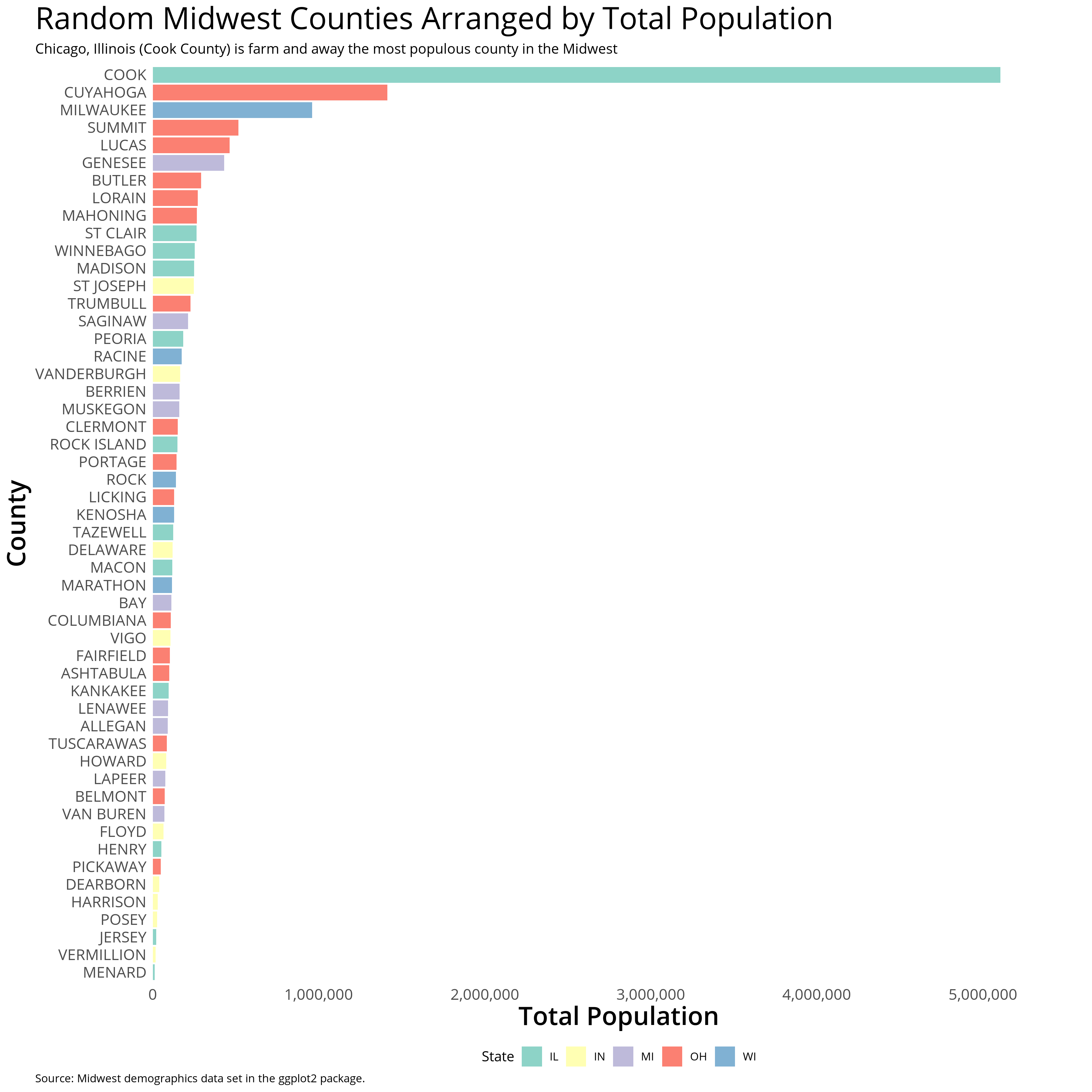
glimpse(midwest)I’ll subset the data a little bit to accomodate the plot and organize
the display order of counties by their total population. The theme_white block of code adds some basic aesthetics and fonts.
Data Manipulation, and Plot Generation
    # data subset and refactoring
    midwest <- midwest[!duplicated(midwest$county), ]
    midwestAAU <- midwest %>% filter(category == "AAU") %>% arrange(poptotal)
    midwestAAU$county <- factor(midwestAAU$county,levels = midwestAAU$county,labels = toupper(midwestAAU$county))

    gg <- ggplot(midwestAAU) + geom_bar(aes(y = poptotal, x = county, fill = state), stat = "identity") +
        scale_y_continuous(expand = expand_scale(mult = c(0, .1)), labels = comma) + coord_flip() + theme_minimal() + labs(title = "Random Midwest Counties Arranged by Total Population",y = "Total Population", x  = "County", fill = "State", subtitle = "Chicago, Illinois (Cook County) is farm and away the most populous county in the Midwest", caption = "Source: Midwest demographics data set in the ggplot2 package.") + scale_fill_brewer(palette = "Set3")

    # plot aesthetics
    theme_white <- theme(text = element_text(family="Open Sans"),
                         panel.grid.major.y=element_blank(),
                         panel.grid.major.x=element_blank(),
                         panel.grid.minor.x=element_blank(),
                         panel.grid.minor.y=element_blank(),
                         plot.title=element_text(size=24,family = "Open Sans",lineheight=.75),
                         axis.title.x=element_text(size=20, family = "Open Sans Semibold"),
                         axis.title.y=element_text(size=20,family = "Open Sans Semibold"),
                         axis.text.x=element_text(size=12),
                         axis.text.y=element_text(size=12),
                         axis.ticks = element_blank(),
                         legend.position = "bottom",
                         legend.margin = margin(b = 0)
    )

    # apply theme and export plot
    gg <- gg + theme_white
    ggsave(gg, filename = "midwestPlotDefaultAlignment.png",height = 12, width = 12, dpi = 300, units = "in", device='png')
Now that we’ve generated our plot we can focus on creating the second legend.
Left-aligning Titles, Subtitles, and Footnotes with Y-Axis Labels in ggplot2
So far we’ve covered ggplot2 functionalities that should create the
~95% of plots I discussed earlier. To expand upon these, let’s get into
some ggplot2 internals. The function ggplotGrob allows us to parse
our saved gg graphical object. This object can be manipulated to
override default ggplot2 conventions or provide methods to hack our
plot in ways that the package isn’t designed for intentionally
(i.e. where there isn’t a compiled function.)
The alignTitles function below easily duplicates a bottom legend at
the top of the plot by:
- Grabbing the ggplot graphical object
- Retrieving the legendGrob within the ggplot object
- Duplicating the legendGrob layout
- Specifying the location of the new legendGrob
- Appending the new legendGrob to the ggplot object
alignTitles Function
    alignTitles <- function(ggplot, title = 2, subtitle = 2, caption = 2) {
      # grab the saved ggplot2 object
      g <- ggplotGrob(ggplot)


      # find the object which provides the plot information for the title, subtitle, and caption
      g$layout[which(g$layout$name == "title"),]$l <- title
      g$layout[which(g$layout$name == "subtitle"),]$l <- subtitle
      g$layout[which(g$layout$name == "caption"),]$l <- caption
      g
    }
We can then redraw our plot with grid.draw:
Plot with Duplicate Legend…Overlapping
    gg2 <- alignTitles(gg)
    ggsave(grid.draw(gg2), filename = "midwestPlotDefaultAlignment2.png",height = 12, width = 12, dpi = 300, units = "in", device='png')
You’ll notice that our caption seems to have disappeared…strange, right?
While the default horizontal alignment for titles and subtitles is
pushed left (hjust = 0) captions are pushed right (hjust = 1.) To
remedy this we can change the argument in theme_white.
Standardize the Title, Subtitle, and Footnote with the Y-Axis Label
    # plot aesthetics
    theme_white <- theme_white + theme(
                         plot.caption = element_text(hjust = 0)

                         )
    gg <- gg + theme_white

    gg2 <- alignTitles(gg)
    ggsave(grid.draw(gg2), filename = "midwestPlotLeftAligned.png",height = 12, width = 12, dpi = 300, units = "in", device='png')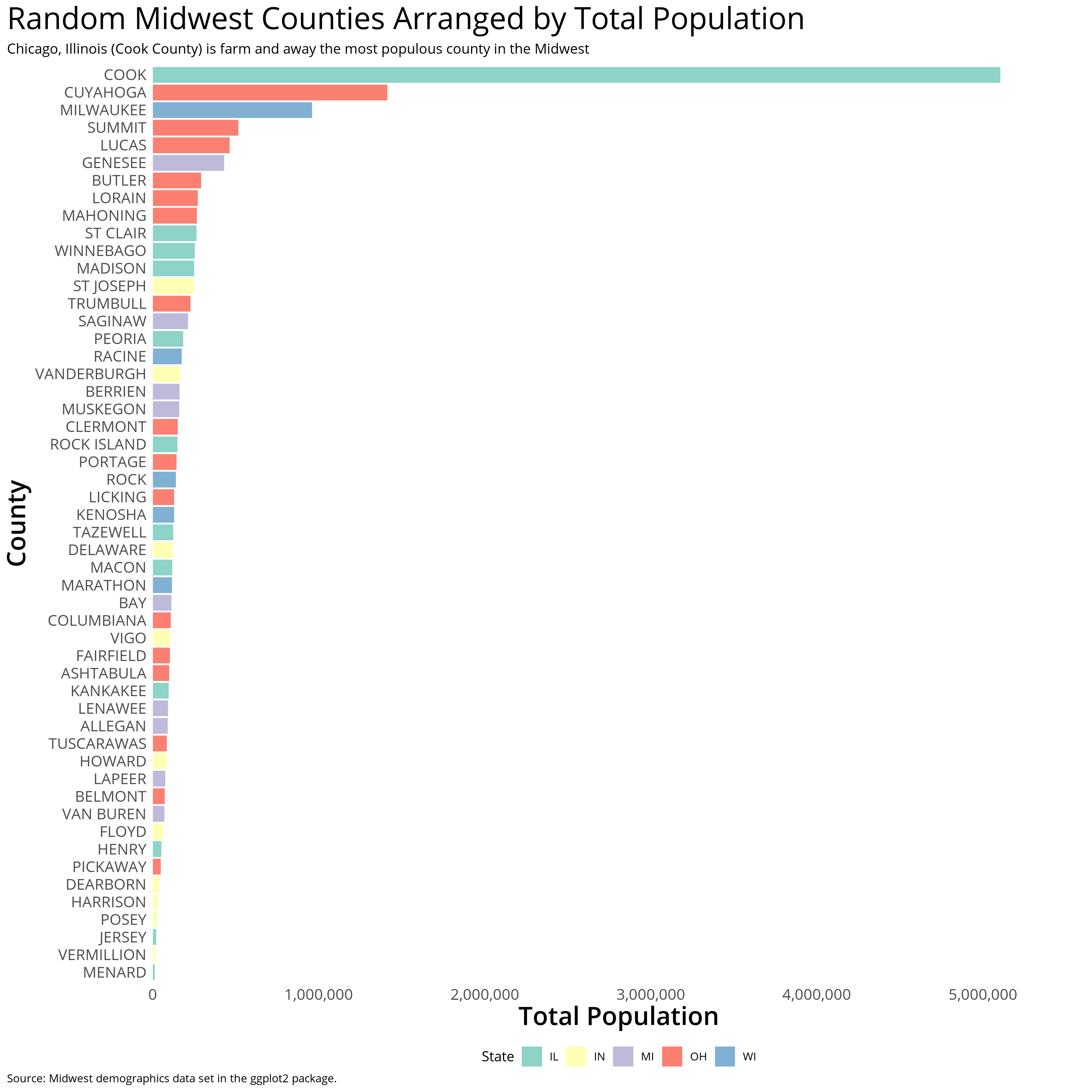
One other note: it’s easy to align the title, subtitle, and caption with other plot components as well, such as the left-most y-axis value label
Standardize the Title, Subtitle, and Footnote with the Y-Axis Label
    # plot aesthetics
    theme_white <- theme_white + theme(
                         plot.caption = element_text(hjust = 0)

                         )
    gg <- gg + theme_white

    gg2 <- alignTitles(gg)
    ggsave(grid.draw(gg2), filename = "midwestPlotLeftAligned.png",height = 12, width = 12, dpi = 300, units = "in", device='png')