Seasonal Virgin River Narrows Discharge
Investigate and visualize the USGS water discharge data for the Virgin River Narrows from 1993 - 2018
This April I’m visiting Zion National Park, one of North America’s most interesting locations to explore geologic formations. One such venue in the park is an iconic hike referred to as The Narrows:

It’s surely even more sensational in person.
Unfortunately, there’s a catch: the Virgin River, a Colorado river tributary that shaped the distinct rock walls of The Narrows, has seasonal water level changes that can force hikers to trek waist deep in the river or close the route entirely. Online sources confirmed my intuition that the spring run-off leads to closures, but I was curious the extent of seasonality. Let’s dig into it!
Accessing the data
The provisional data for the East Fork of the Virgin River can be easily accessed via the USGS website, including discharge and gage height. I’ll focus on the discharge levels here, since the speed of the river (and not it’s height) is what seems to precipitate closures. The speed threshold that merits closure of The Narrows was inconsistent across the sites I investigated but the level I saw most often - 150 cfs - is what I will use.
A brief aside: the USGS logs some super interesting data to visualize time series. Here are some continually updated sources of water data for Utah, for example. So much to explore!
Back to The Narrows data. So we’ve got out the csv and it was completely clean like always the end! Not.
Cleaning the data
There was quite a few strange coding choices made through the years
accessed (1993 - 2018). What follows are those gory recoding details.
One nifty function I learned more about was dplyr::separate which
allows you to specify the direction you’d like to merge the characters
you’re separating. This allowed me to push values of 0 seconds ino the
seconds column, even though there were some values where there were no
adjoining hours or minutes attached. Nifty!
    library(dplyr)
    library(tidyr)
    library(ggplot2)
    library(lubridate)
    library(animation)
    library(grid)
    x <- read.csv("/home/michael/Documents/Github/mikeleeco.github.com/static/data/narrows.Rdata", row.names = NULL, stringsAsFactors = FALSE)
    x <- x[1:530086,]
    x2 <- read.csv("/home/michael/Documents/Github/mikeleeco.github.com/static/data/narrows2.csv", row.names = NULL, stringsAsFactors = FALSE)
    x <- rbind(x,x2)
    rm(x2)
    x <- x %>% separate(datetime, c("date", "time"), " ", extra = "merge")
    x$date <- mdy(x$date)
    x$timeparse <- hm(x$time)
    x <- x %>% separate(timeparse, c("hour", "minute", "second"), " ", extra = "merge", fill = "left")
    x$hour <- gsub("H", "", x$hour)
    x$minute <- gsub("M", "", x$minute)
    x$second <- gsub("S", "", x$second)
    x[,c("hour","minute","second")] <- sapply(x[,c("hour","minute","second")], as.numeric)
    x$hour <- ifelse(is.na(x$hour),0 ,x$hour)
    x$minute <- ifelse(is.na(x$minute),0 ,x$minute)
    x$hour <- ifelse(grepl("PM", x$time), x$hour + 12,x$hour)
    x$hour <- ifelse(nchar(x$hour) < 2, paste0("0",as.character(x$hour)),as.character(x$hour))
    x$minute <- ifelse(nchar(x$minute) < 2, paste0("0",as.character(x$minute)),as.character(x$minute))
    x$second <- ifelse(nchar(x$second) < 2, paste0("0",as.character(x$second)),as.character(x$second))
    x$hour <- ifelse(grepl("24", x$hour), "00",x$hour)
    x$timeUpdate <- paste(x$hour,x$minute,x$second, sep = ":")
The full data source as an .Rdata file can be accessed through this link:
Drill down and visualize
The dplyr and lubridate package make it easy to extract seasonality
in the data:
    dischargeByDay <- x %>% mutate(day = yday(date)) %>%
      group_by(day) %>%
      summarise(avgDischarge = mean(discharge, na.rm = TRUE))

    dischargeByDay$day <- as.Date(as_date(dischargeByDay$day))
    dischargeByDay$month <- month(dischargeByDay$day, label = TRUE)

    plot(dischargeByDay$day, dischargeByDay$avgDischarge)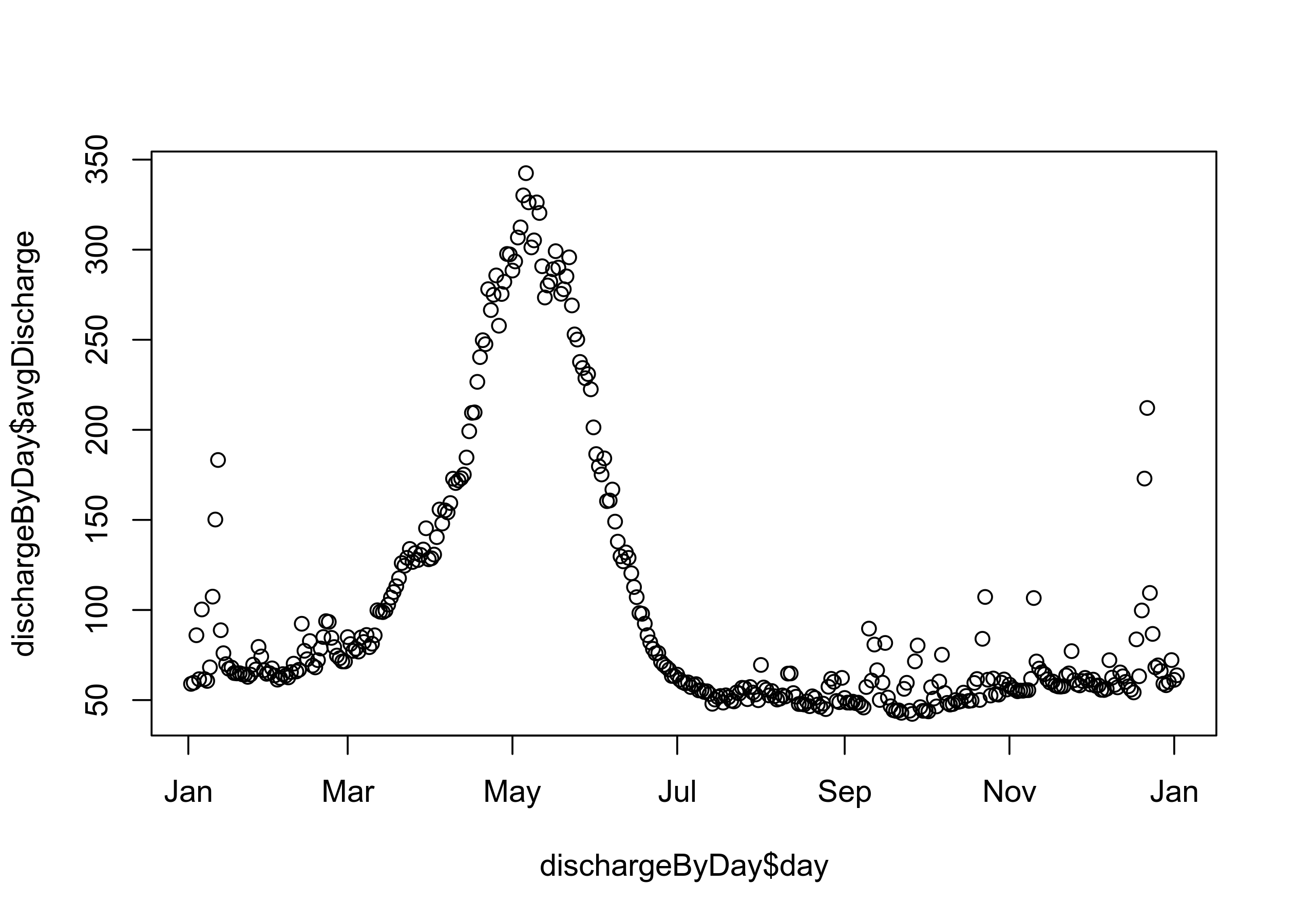
This result is convincing on it’s own: on average from 1993 to 2018, after about 100 days and lasting until about the 160th day (April 10th - June 10th), the discharge level breaks the 150 cfs threshold that closes The Narrows hiking route.
Lets take this result and make it more visually engaging by adding some animation.
Start with our skeleton plot
I’ve been poking around with image dimensions and themes for distribution through twitter, and the following theme seems to be a quality balance between plot elements:
    theme_white <- theme(text = element_text(family="Open Sans", color = "black"),
                         panel.grid = element_blank(),
                         panel.border = element_blank(),
                         axis.title.x=element_text(size=26, family = "Open Sans", margin = margin(t=15, b = 0)),
                         axis.title.y=element_text(size=26, family = "Open Sans", margin = margin(r=15, l = 5)),
                         axis.text.x=element_text(size=22, hjust = 0, family = "Open Sans Light"),
                         axis.text.y=element_text(size=22, family = "Open Sans Light"),
                         axis.ticks = element_blank(),
                         plot.title=element_text(size=34,family = "Open Sans Extrabold",hjust= 0,lineheight=1, margin = margin(t = 15)),
                         plot.subtitle=element_text(size=26, margin = margin(t=15, b = 5),family = "Open Sans"),
                         plot.caption=element_text(size=18, hjust = 0,margin=margin(t=15, b = 15),lineheight=1.15, family = "Open Sans"),
                         legend.position="none"
    )
It’s important to impelement limits and breaks in the y and x scales to keep the axes stable when using ggplot2 for animation. Otherwise, the plot axes will expand according to the subset of data used in the figure.
    gg <- ggplot(dischargeByDay, aes(x = day, y = avgDischarge, group = 1)) +
      scale_y_continuous(limits = c(0, 350), expand = c(0,0)) +
      scale_x_date(date_breaks = "1 month", date_labels =  "%b", expand = c(0,0),limits = c(min(dischargeByDay$day)-1,max(dischargeByDay$day)-2)) +
      labs(title = "Mean Flow of the VIRGIN RIVER NARROWS by day (1993 - 2018)",
           subtitle = "If the river is flowing at over 150 Cubic Feet per Second (CFS) the narrows is closed",
           caption = "Data Accessed 3/16/2018, retrieved via https://nwis.waterdata.usgs.gov/usa/nwis/uv/") +
      xlab("Date") + ylab("Average Discharge") +
      theme_bw() + theme_white
    gg
We’ll then use tweenr and animation to refine the visualization with
smooth transitions.
Animate all the things!
    gifReplicate <- function(x) {
      grid.newpage()
      grid.draw(x)
    }

    yDates <- seq(from = 0, to = max(as.numeric(dischargeByDay$day)), by = 3)
    yDates[1] <- 1

    saveGIF({

      for (i in yDates) {

        gg2 <- gg + geom_point(data = subset(dischargeByDay, day <=i), aes(x = day, y = avgDischarge), alpha = .1)
        g <- ggplotGrob(gg2)
        g$layout$l[g$layout$name == "title"] <- 3
        g$layout$l[g$layout$name == "caption"] <- 3
        g$layout$l[g$layout$name == "subtitle"] <- 3
        grid::grid.draw(g);
        grid.newpage()
      }

      grid::grid.draw(g);
      replicate(10,gifReplicate(g))

      for (i in seq(from =1, to = 366, by = 7)) {

        gg3 <- gg2 + geom_segment(x = 1, xend = i, y = 150,yend = 150, color= "red", linetype = 2)
        g <- ggplotGrob(gg3)
        g$layout$l[g$layout$name == "title"] <- 3
        g$layout$l[g$layout$name == "caption"] <- 3
        g$layout$l[g$layout$name == "subtitle"] <- 3
        grid::grid.draw(g);
        grid.newpage()
      }

      for (i in yDates) {

        gg4 <- gg3 + stat_smooth(data = subset(dischargeByDay, day <=i), aes(x = day), se = F, method = "lm", formula = y ~ poly(x, 20))
        g <- ggplotGrob(gg4)
        g$layout$l[g$layout$name == "title"] <- 3
        g$layout$l[g$layout$name == "caption"] <- 3
        g$layout$l[g$layout$name == "subtitle"] <- 3
        grid::grid.draw(g);
        grid.newpage()
      }

      grid::grid.draw(g);
      replicate(100,gifReplicate(g))
  grid.draw(gg4)
  geom_hline(yintercept = 150, color= "red", linetype = 2) +
    geom_line(aes(x=day, y=avgDischarge), size=1.3) +
    },movie.name=paste0(getwd(),"/narrowsLarge.gif"),interval = .02, ani.width = 1200, ani.height = 800)

    gif_compress <- function(ingif, outgif, show=TRUE, extra.opts=""){
      command <-  sprintf("gifsicle -O3 %s < %s > %s", extra.opts, ingif, outgif)
      system.fun <- if (.Platform$OS.type == "windows") shell else system
      if(show) message("Executing: ", strwrap(command, exdent = 2, prefix = "\n"))
      system.fun(ifelse(.Platform$OS.type == "windows", sprintf(""%s"", shQuote(command)), command))
    }

    gif_compress(paste0(getwd(),"/narrowsLarge.gif"),
                 paste0(getwd(),"/narrowsLargeTall.gif"))
Addendum - Further Data Exploration Needed:
After generating this animation and before sitting down to write this post, I explored the data a little bit more. To my delight (or chagrin) there appears to be a daily pattern to the discharge level. Looking at just April results, the discharge level decreases from 2pm to 5pm before reversing course and increasing until about 2am.
    dischargeByAprilHour <- x %>% filter(month(date) == 4) %>%
      mutate(day = yday(date)) %>%
      group_by(hour) %>%
      summarise(avgDischarge = mean(discharge, na.rm = TRUE))
    plot(dischargeByAprilHour$hour, dischargeByAprilHour$avgDischarge)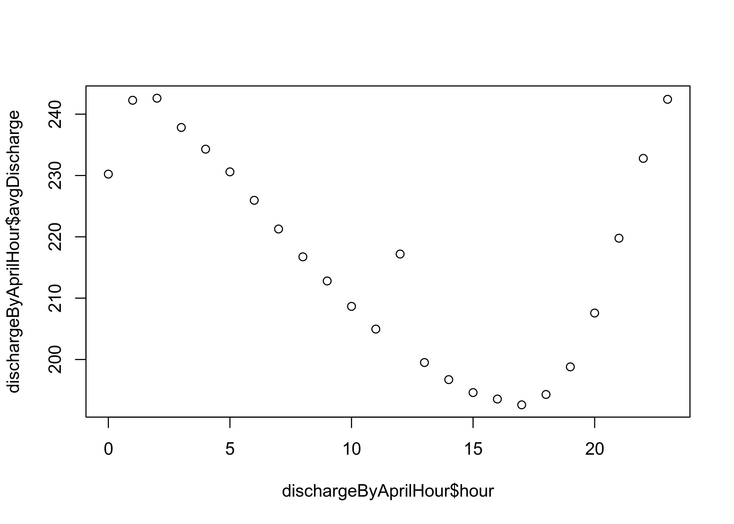
An exploration for another day or another analyst!
Interested in learning more? Hire me to consult on your next project, follow me on twitter, or contact me via email. All inquiries welcome!