Wisconsin State Hex Grid - Mapping 2016 Presidential Results
Use the hexmapr package to map the Wisconsin 2016 Presidential Results
NOTE: find this package here:
https://github.com/hafen/hexmapr with `devtools::install_github("hafen/hexmapr")`
NEAT PACKAGE ALERT!
My 1st R package! https://t.co/dI3GJbC7FQ Automatically turn geospatial polygons like states into regular/hexagonal grids \#rstats \#ggplot2 pic.twitter.com/dxvYCZWJzU
— J Bailey (@iammrbailey)
October 31, 2017
I’ve been thinking about implementing something like this for a while - got excited by this tweet I thought I would do some exploring and write out a post over the weekend. Creating a county-level hex grid of Wisconsin makes for a perfect supplment to my earlier post about mapping the 2016 Wisconsin presidential results.
Let’s make a hex grid of Wisconsin
The first thing we’ll do is retrieve a Wisconsin shapefile; we can use
the tigris package developed by Kyle Walker to pull a 2010 census
shapefile of Wisconsin counties:
library(tigris)
wi <- counties("Wisconsin", cb = TRUE)
wi_original <- wi
plot(wi)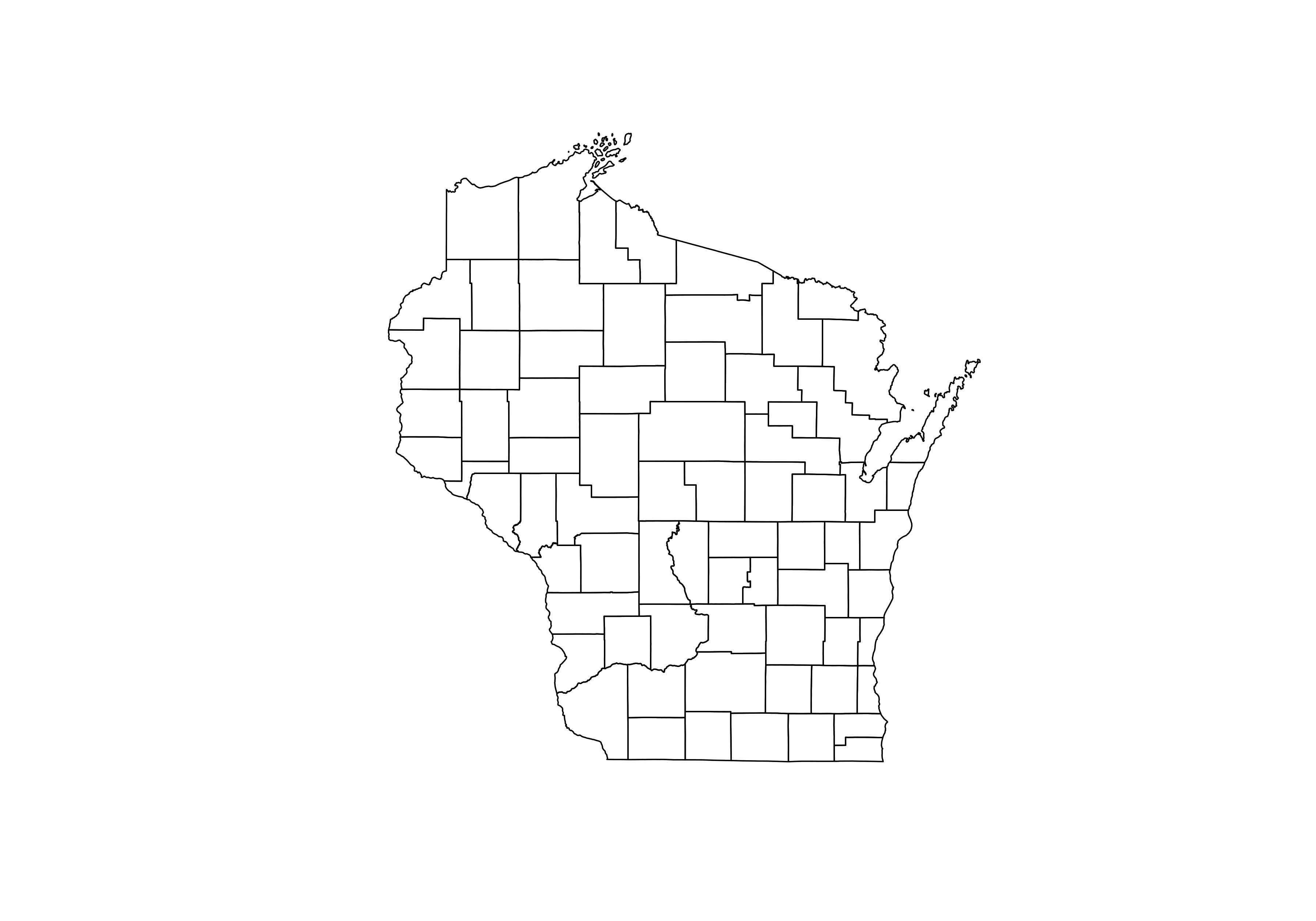
We’ll then port some code from the hexmapr github README:
devtools::install_github("sassalley/hexmapr")
library(hexmapr)
wi_details <- hexmapr::get_shape_details(wi)
wi@data$xcentroid <- coordinates(wi)[,1]
wi@data$ycentroid <- coordinates(wi)[,2]
We’re going for the closest shapefile match, preferring a final shape than looks like the outline of the state than one with appropriate placement of counties - there is rarely a perfect grid match. So let’s test a whole bunch:
# hexagon - red border for the 28th seed
png(file = "/home/michael/Documents/mikeleeco.github.com/static/img/hexGridWisconsin.png", width = 700, height = 500)
par(mfrow=c(7,5), mar = c(0,1,2,1))
for (i in 1:35){
  new_cells <-  calculate_cell_size(wi, wi_details,0.03, 'hexagonal', i)
  if(i == 28) {
    plot(new_cells[[2]], main = paste("Seed",i, sep=" "), border = "red")
  } else {
    plot(new_cells[[2]], main = paste("Seed",i, sep=" "))
  }
}

# squares - red border for the 7th seed
png(file = "/home/michael/Documents/mikeleeco.github.com/static/img/squareGridWisconsin.png", width = 700, height = 500)
par(mfrow=c(7,5), mar = c(0,1,2,1))
for (i in 1:35){
  new_cells <-  calculate_cell_size(wi, wi_details,0.03, 'regular', i)
  if(i == 7) {
    plot(new_cells[[2]], main = paste("Seed",i, sep=" "), border = "red")
  } else {
    plot(new_cells[[2]], main = paste("Seed",i, sep=" "))
  }
}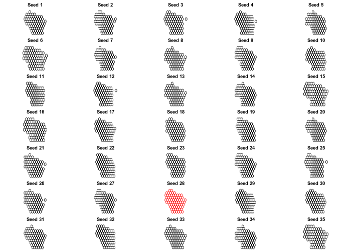
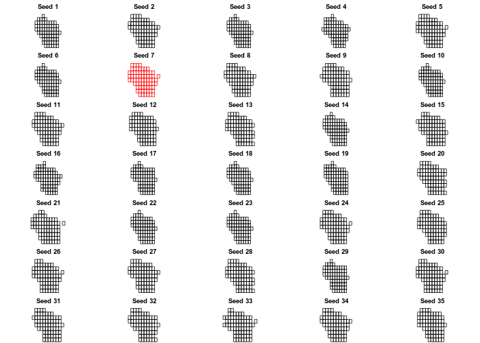
I like the look of the 28th hexagon grid, and the 7th square grid. Let’s
take those and assign the polygons to a new SpatialPolygonsDataFrame,
then fortify .
library(dplyr)
library(ggplot2)
clean <- function(shape){
  shape@data$id = rownames(shape@data)
  shape.points = fortify(shape, region="id")
  shape.df = left_join(shape.points, shape@data, by="id")
}

new_cells_hex <-  calculate_cell_size(wi_original, wi_details,0.03, 'hexagonal', 28)
resulthex <- assign_polygons(wi_original,new_cells_hex)
result_df_hex <- clean(resulthex)

new_cells_square <-  calculate_cell_size(wi_original, wi_details,0.03, 'regular', 7)
resultsquare <- assign_polygons(wi_original,new_cells_square)
result_df_square <- clean(resultsquare)
Now that we’ve got our modified SpatialPolygonsDataFrames - covered to a dataframe for use with ggplot2 - we can plot the result using geom_polygon:
library(viridis)
library(extrafont)
loadfonts()
theme_open_sans <- theme(text=element_text(family="Open Sans"), plot.title = element_text(family = "Open Sans Semibold", size = 24), plot.subtitle = element_text(family = "Open Sans Light",size = 14), legend.title = element_text(family="Open Sans Semibold"))
hexplot <- ggplot(result_df_hex) +
  geom_polygon(aes(x=long, y=lat, fill = as.numeric(ALAND), group = group))+
  geom_text(aes(V1, V2, label = NAME), size=2.5, color = "white", family = "Open Sans") +
  scale_fill_viridis() +
  guides(fill=FALSE) +
  theme_void() + theme_open_sans

hexplot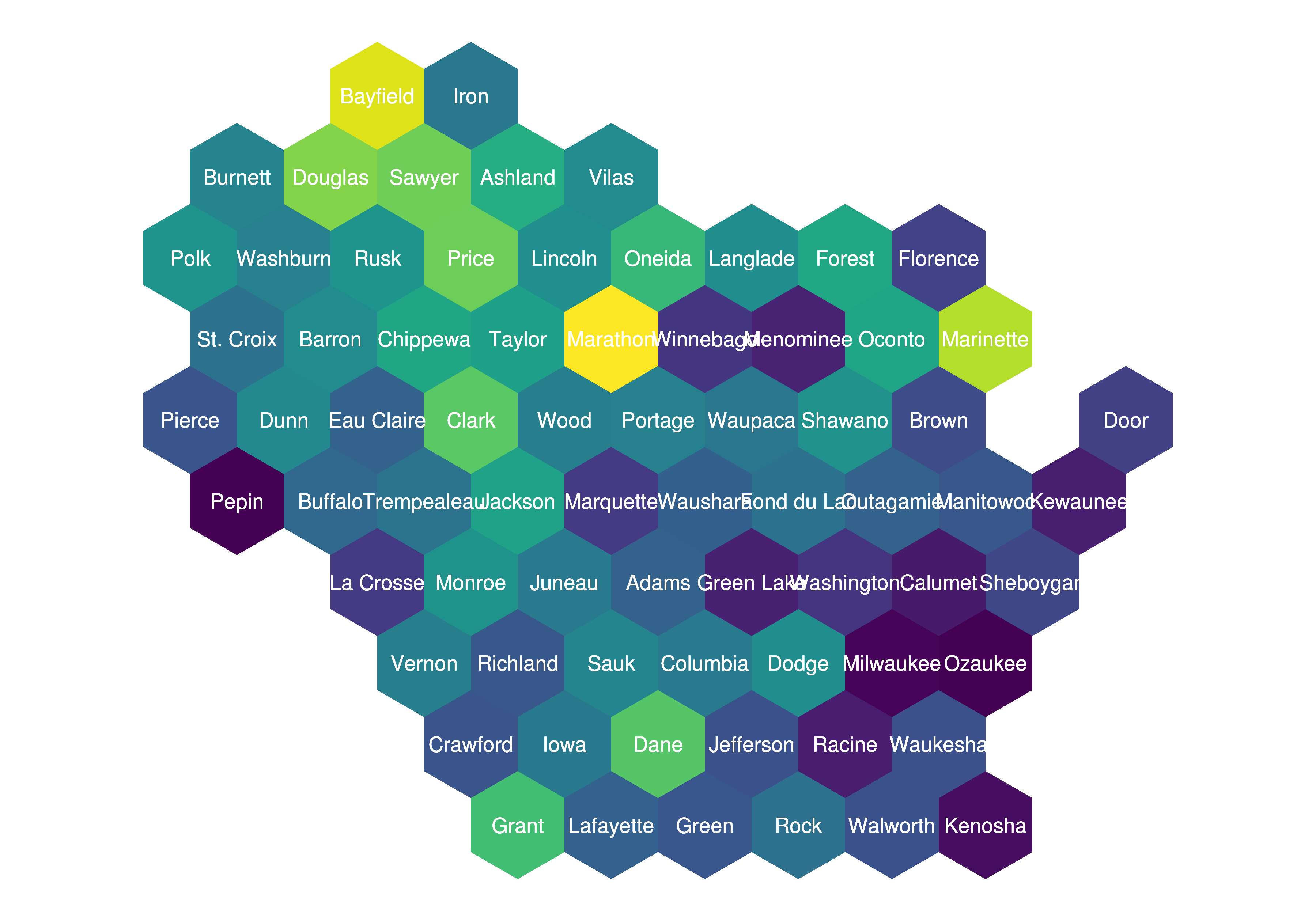
squareplot <- ggplot(result_df_square) +
  geom_polygon(aes(x=long, y=lat, fill = as.numeric(ALAND), group = group))+
  geom_text(aes(V1, V2, label = NAME), size=2.5, color = "white", family = "Open Sans") +
  scale_fill_viridis() +
  guides(fill=FALSE) +
  theme_void() + theme_open_sans

squareplot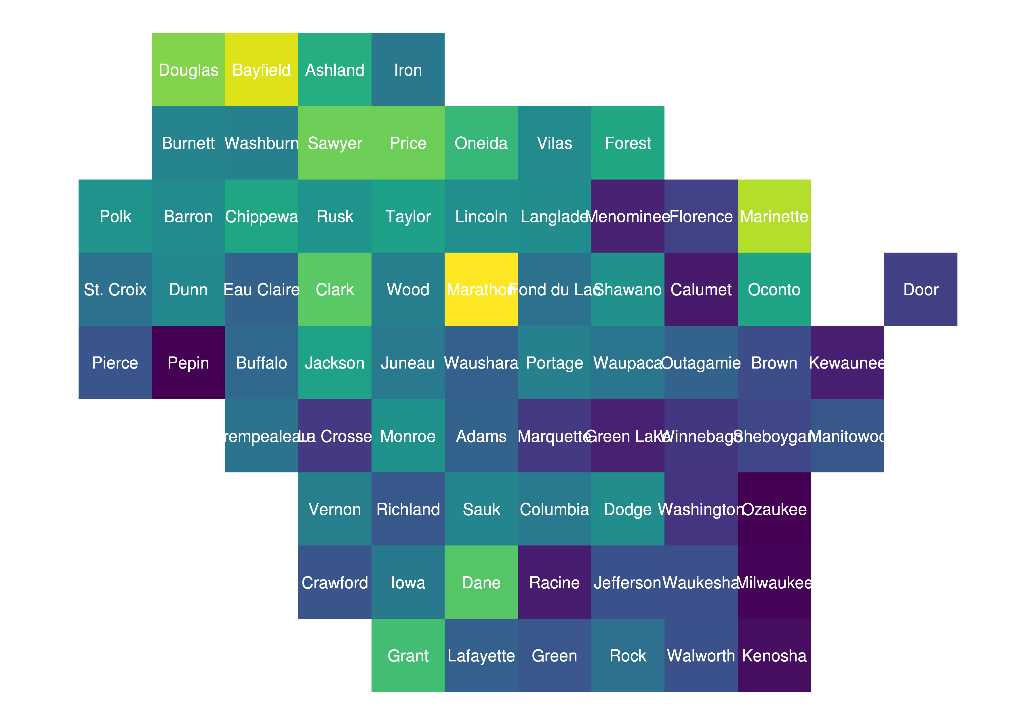
I saw on twitter that sf can now be used natively, so I gave that I try as well. First convert the SpatialPolygonsDataFrame to a simple feature (sf), then plot the resultant object using geom_sf:
sfResultSquare <- st_as_sf(resultsquare)
sfResultHex <- st_as_sf(resulthex)
class(sfResultHex)
sfHexPlot <-ggplot(sfResultHex) +
    geom_sf(aes(fill = as.numeric(ALAND)), color = "transparent") +
    geom_text(aes(V1, V2, label = NAME), size=2.5, color = "white", family = "Open Sans") +
    scale_fill_viridis() +
    guides(fill=FALSE) +
    theme(panel.background = element_rect(fill = NA), axis.text = element_blank(), axis.ticks = element_blank(), axis.title = element_blank())

sfHexPlot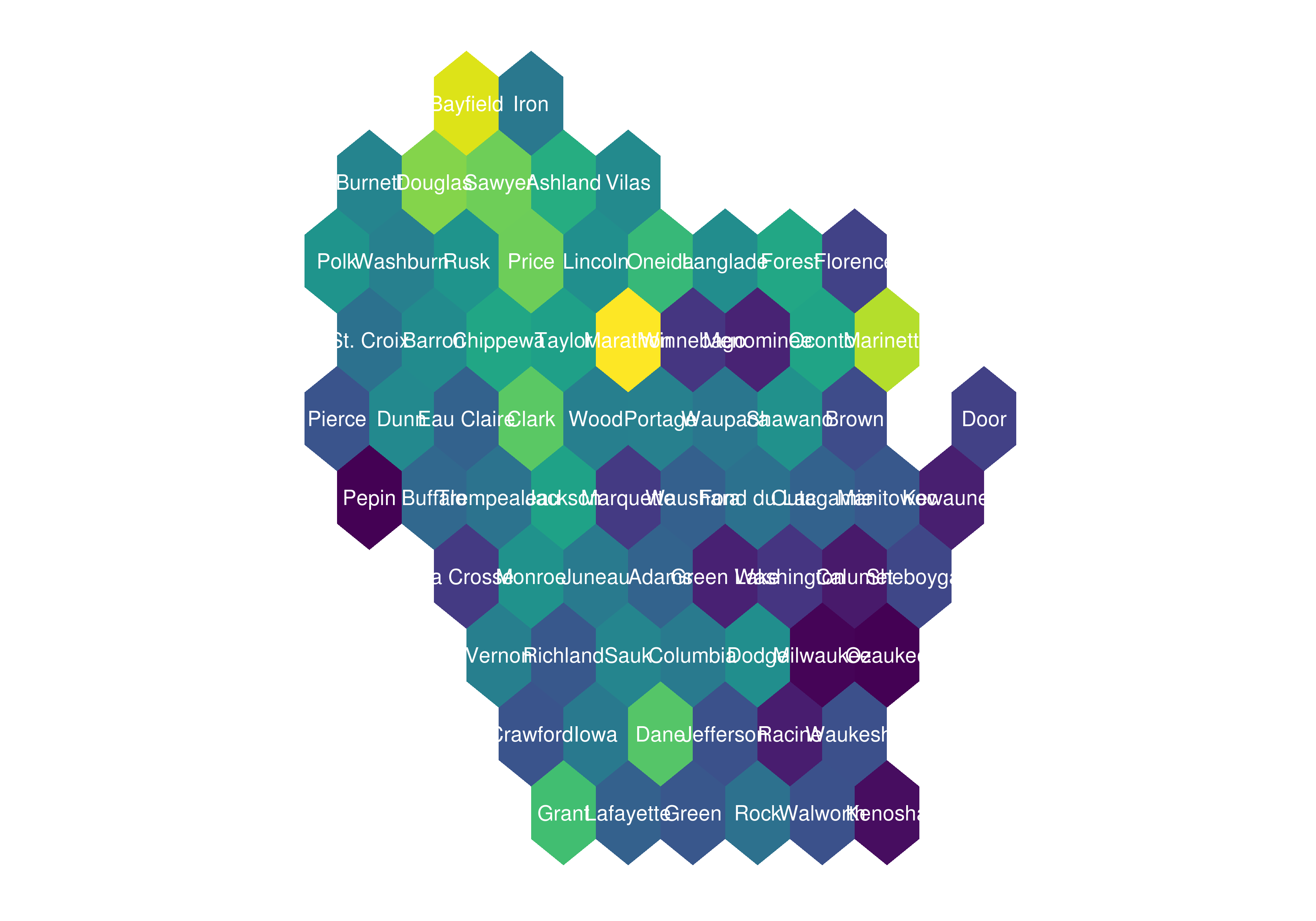
Cool to know that’s possible! Let’s use some more novel data than land area. Building off of a previous post mapping Wisconsin presidential election results, let’s map vote totals to our new gridmaps.
library(stringr)
library(tidyr)
all_results <- read.csv("https://raw.githubusercontent.com/mkearney/presidential_election_county_results_2016/master/pres16results.csv", stringsAsFactors = FALSE)

wisconsin <- all_results %>%
  filter(str_detect(fips, "^55"))

wisconsin_spread <- wisconsin %>%
  filter(cand %in% c("Donald Trump", "Hillary Clinton")) %>%
  select(fips, cand, votes, total_votes) %>%
  spread(cand, votes)

wisconsin_spread <- wisconsin_spread %>% mutate(voteDiff = `Donald Trump` - `Hillary Clinton`,
                                                pctDiff = `Donald Trump`/total_votes - `Hillary Clinton`/total_votes,
                                                weight = total_votes/ sum(total_votes))
wisconsin_spread$weight <- ifelse(wisconsin_spread$pctDiff > 0 , -wisconsin_spread$weight, wisconsin_spread$weight)
We can create some custom breaks to give counties with higher vote totals more prominence in the figure, then merge these onto our hex and square SpatialPolygonsDataFrame:
wisconsin_spread$breaks <- cut(wisconsin_spread$weight,
                               breaks = c(-1, -.1, -0.05, -0.01, 0, 0.01, .05, .1, 1),
                               labels = c("R   More than 10 Percent", "R   5 to 10 Percent", "R   1 to 5 Percent", "R   Less than 1 Percent",
                                          "D   Less than 1 Percent","D   1 to 5 Percent", "D   5 to 10 Percent", "D   More than 10 Percent"))
wiHex <- merge(result_df_hex, wisconsin_spread, by.x = "GEOID", by.y = "fips")
wiSquare <- merge(result_df_square, wisconsin_spread, by.x = "GEOID", by.y = "fips")
Once we’ve got our data sets finalized, figures are created usng geom_polygon:
library(RColorBrewer)

wiHexPlot <- ggplot(wiHex) +
    geom_polygon(aes(x=long, y=lat, fill=breaks, group = group), color = "#f5f5f5") +
    geom_text(aes(V1, V2, label = NAME), size=2.5, color = "black", family = "Open Sans") +
    scale_fill_manual(name = "Portion of WI Vote", values = brewer.pal(8, "RdBu"), drop = FALSE) +
    guides(alpha=FALSE) +
    ggtitle(label = "2016 Presidential Results by Wisconsin Counties", subtitle = "59 of 72 Wisconsin counties leaned Republican, while the only two counties with\nmore than 10 percent of the state's votes totaled more Democratic votes") +
    theme(panel.background = element_rect(fill = NA), axis.text = element_blank(), axis.ticks = element_blank(), axis.title = element_blank()) +
    theme_open_sans

wiHexPlot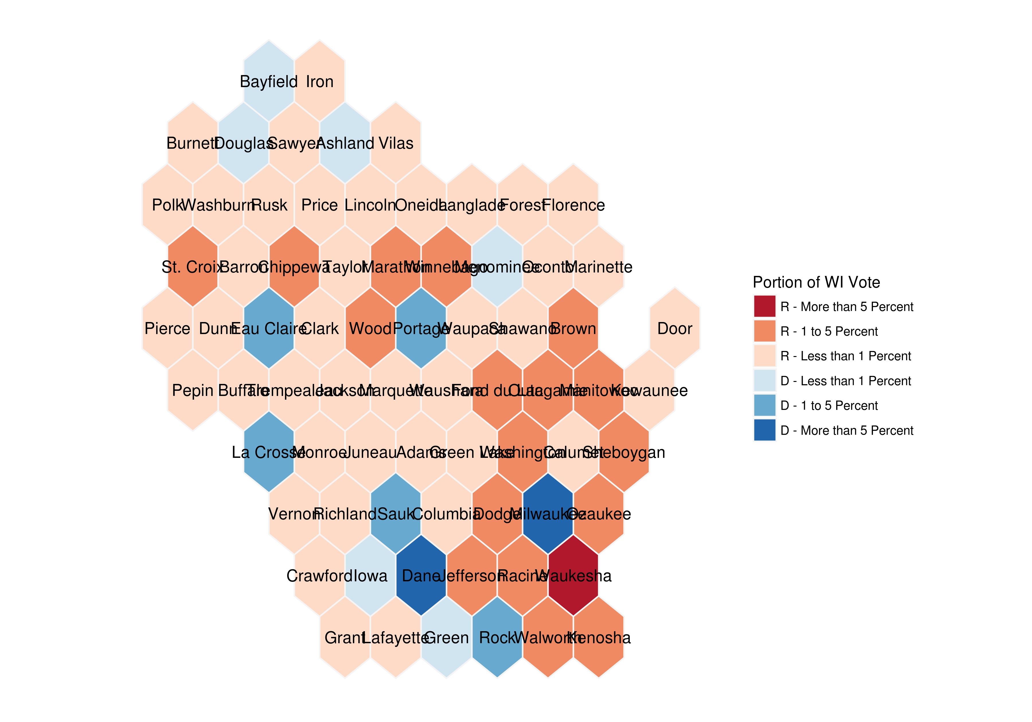
wiSquarePlot <- ggplot(wiSquare) +
    geom_polygon(aes(x=long, y=lat, fill=breaks, group = group), color = "#f5f5f5") +
    geom_text(aes(V1, V2, label = NAME), size=2.5, color = "black", family = "Open Sans") +
    scale_fill_manual(name = "Percentage of WI Vote Total", values = brewer.pal(8, "RdBu"), drop = FALSE) +
    guides(alpha=FALSE) +
    ggtitle(label = "2016 Presidential Results by Wisconsin Counties", subtitle = "59 of 72 Wisconsin counties leaned Republican, while the only two counties with\nmore than 10 percent of the state's votes totaled more Democratic votes") +
    theme(panel.background = element_rect(fill = NA), axis.text = element_blank(), axis.ticks = element_blank(), axis.title = element_blank()) +
    theme_open_sans

wiSquarePlot