Mapping Wisconsin Presidential Election Results
Wisconsin played a major role in the presidential election, but the result is not due to major differences with its Midwest neighbor.
“Your home state did us no favors…”
As a Wisconsinite transplanted into the highest density of left-leaning voters in the country (District of Columbia) I’ve heard from several friends over the weeks in the aftermath of the US presidential election that voters in my home state should shoulder responsibility for contributing to Donald Trump winning an electoral majority.
The “winner-take-all” basis in which electoral votes are allocated means the margin of victory in each state is null - extra votes don’t matter - which contributes to an outcome in which a winning candidate can have fewer total votes than another nominee.
Big Idea
The urban/rural divide has been a popular explanation for Donald Trump’s electoral victory in the 2016 presidential election. Does this theory explain why Trump won Wisconsin and Clinton won Minnesota?
This post seeks to explore this idea. First, a bit of background. These two Midwestern neighbors have striking population, demographic, and social indicator similarities. Recent gubernatorial and congressional elections in both states have resulted in major party shifts. The policies of Wisconsin’s Republican governor Scott Walker and Minnesota’s Democratic governor Mark Dayton and their impact on state success has inspired several comparisons and juxtaposed analyses. While each state has elected Republican or Independent candidates as governors in the last few decades, the Democratic nominee has won each state in 7 straight presidential elections from 1988 to 2012.
Let’s try to unpack the voting results in each state in 2016.
Wisconsin Voting Results
I started this analysis using Julia Silge’s Utah Election Mapping script, then supplemented these analyses with urban and rural county population numbers from the 2010 Census. First, I loaded the R package libraries. Next, I read in the county level 2016 presidential election results and 2010 census data:
library(readr)
library(choroplethr)
library(choroplethrMaps)
library(ggplot2)
library(ggthemes)
library(RColorBrewer)
library(gridExtra)
library(dplyr)
library(stringr)
library(tidyr)
library(extrafont)
extrafont::loadfonts(quiet = TRUE)

all_results <- read_csv("https://raw.githubusercontent.com/mkearney/presidential_election_county_results_2016/master/pres16results.csv")

urban <- read.table("http://www2.census.gov/geo/docs/reference/ua/PctUrbanRural_County.txt",
                  header=TRUE,sep=",", colClasses = "character")
urban$fips <- paste0(urban$STATE,urban$COUNTY)
urban <- urban %>% select(POP_COU, POPPCT_URBAN, fips)
urban[,1:2] <- sapply(urban[,1:2], as.numeric)
all_results <- left_join(all_results,urban)
Once the data is read and joined together through the fips code in each data set, we can subset all_results to determine the percent of votes allocated for the two major party candidates, as well as the two most popular candidates from alternative parties:
wisconsin <- all_results %>%
  filter(str_detect(fips, "^55"))
wisconsin_spread <- wisconsin %>%
filter(cand %in% c("Donald Trump", "Hillary Clinton", "Gary Johnson", "Jill Stein")) %>%
select(fips, cand, pct) %>%
mutate(pct = pct * 100,
region = as.numeric(fips)) %>%
spread(cand, pct) %>%
select(-fips)
wisconsin_spread## # A tibble: 72 × 5
## region `Donald Trump` `Gary Johnson` `Hillary Clinton` `Jill Stein`
## * <dbl> <dbl> <dbl> <dbl> <dbl>
## 1 55001 59.19660 2.048085 37.39982 0.7915306
## 2 55003 43.25006 2.296240 52.18269 1.7663386
## 3 55005 60.38465 3.224660 35.00489 0.7506440
## 4 55007 43.46223 1.959751 52.18628 1.9492150
## 5 55009 52.70085 3.907543 41.85040 1.0753194
## 6 55011 58.50311 3.149834 36.56986 1.0692097
## 7 55013 62.07134 2.626448 33.81122 0.7684367
## 8 55015 58.06122 3.980476 36.45238 0.7718794
## 9 55017 56.91589 3.835277 37.73315 0.8388675
## 10 55019 63.81016 3.291999 31.18541 0.7897845
## # ... with 62 more rowsNow that our data has been reshaped, we can further subset by candidate to create county-level voting maps, using Ari Lamstein’s choroplethr package.
wisconsin_spread$value <- wisconsin_spread$`Donald Trump`
choro1 = CountyChoropleth$new(wisconsin_spread)
choro1$set_zoom("wisconsin")
choro1$title = "Donald Trump"
choro1$set_num_colors(1)
choro1$ggplot_polygon = geom_polygon(aes(fill = value), color = NA)
choro1$ggplot_scale = scale_fill_gradientn(name = "Percent",
                                           colours = brewer.pal(8, "Reds"))

wisconsin_spread$value <- wisconsin_spread$`Hillary Clinton`
choro2 = CountyChoropleth$new(wisconsin_spread)
choro2$set_zoom("wisconsin")
choro2$title = "Hillary Clinton"
choro2$set_num_colors(1)
choro2$ggplot_polygon = geom_polygon(aes(fill = value), color = NA)
choro2$ggplot_scale = scale_fill_gradientn(name = "Percent",
                                           colours = brewer.pal(8, "Blues"))

wisconsin_spread$value <- wisconsin_spread$`Gary Johnson`
choro3 = CountyChoropleth$new(wisconsin_spread)
choro3$set_zoom("wisconsin")
choro3$title = "Gary Johnson"
choro3$set_num_colors(1)
choro3$ggplot_polygon = geom_polygon(aes(fill = value), color = NA)
choro3$ggplot_scale = scale_fill_gradientn(name = "Percent",
                                           colours = brewer.pal(8, "Purples"))

wisconsin_spread$value <- wisconsin_spread$`Jill Stein`
choro4 = CountyChoropleth$new(wisconsin_spread)
choro4$set_zoom("wisconsin")
choro4$title = "Jill Stein"
choro4$set_num_colors(1)
choro4$ggplot_polygon = geom_polygon(aes(fill = value), color = NA)
choro4$ggplot_scale = scale_fill_gradientn(name = "Percent",
                                           colours = brewer.pal(8, "Greens"))

grid.arrange(choro1$render() + theme(text=element_text(family="DejaVu Sans Mono")),
             choro2$render() + theme(text=element_text(family="DejaVu Sans Mono")),
             choro3$render() + theme(text=element_text(family="DejaVu Sans Mono")),
             choro4$render() + theme(text=element_text(family="DejaVu Sans Mono")), ncol = 2, nrow =2)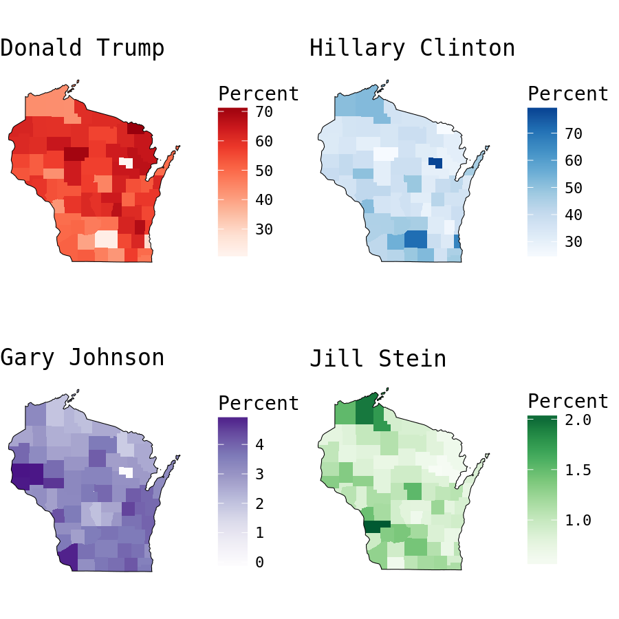
A bar graph more accurately displays the results by candidate. Wisconsin’s 10 electoral votes were decided by only 27257 votes! That is a really small margin.
votes <- wisconsin %>%
  filter(cand %in% c("Donald Trump", "Hillary Clinton", "Gary Johnson","Jill Stein")) %>%
  mutate(cand = factor(cand, levels = c("Donald Trump", "Hillary Clinton", "Gary Johnson","Jill Stein"))) %>%
  group_by(cand) %>%
  summarise(sum = sum(votes))

ggplot(votes, aes(cand, sum, fill = cand)) +
  geom_bar(stat = "identity", alpha = 0.8) +
  theme_tufte(base_family = "DejaVu Sans Mono") +
  scale_fill_manual(values = c("red3", "navyblue", "#6A51A3","darkgreen")) +
  theme(legend.position="none") +
  labs(title = "Total Votes Cast in Wisconsin", y = "Number of votes", x = NULL)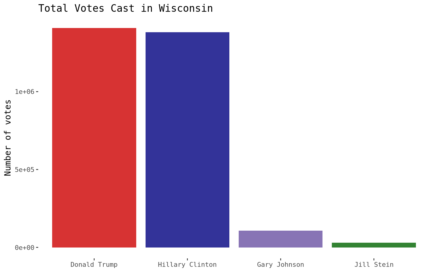
Wisconsin and Minnesota Voting Results
To get a better sense of how the results compare, lets perform the same analyses using both Wisconsin and Minnesota data.
minnesotawisconsin <- all_results %>%
  filter(str_detect(fips, c("^55")) | str_detect(fips, c("^27")))
minnesotawisconsin_spread <- minnesotawisconsin %>%
filter(cand %in% c("Donald Trump", "Hillary Clinton", "Gary Johnson", "Jill Stein")) %>%
select(fips, cand, pct) %>%
mutate(pct = pct * 100,
region = as.numeric(fips)) %>%
spread(cand, pct) %>%
select(-fips)
minnesotawisconsin_spread$value <- minnesotawisconsin_spread$`Donald Trump`
choro1 = CountyChoropleth$new(minnesotawisconsin_spread)
choro1$set_zoom(c("minnesota","wisconsin"))
choro1$title = "Donald Trump"
choro1$set_num_colors(1)
choro1$ggplot_polygon = geom_polygon(aes(fill = value), color = NA)
choro1$ggplot_scale = scale_fill_gradientn(name = "Percent",
colours = brewer.pal(8, "Reds"))
minnesotawisconsin_spread$value <- minnesotawisconsin_spread$`Hillary Clinton`
choro2 = CountyChoropleth$new(minnesotawisconsin_spread)
choro2$set_zoom(c("minnesota","wisconsin"))
choro2$title = "Hillary Clinton"
choro2$set_num_colors(1)
choro2$ggplot_polygon = geom_polygon(aes(fill = value), color = NA)
choro2$ggplot_scale = scale_fill_gradientn(name = "Percent",
colours = brewer.pal(8, "Blues"))
minnesotawisconsin_spread$value <- minnesotawisconsin_spread$`Gary Johnson`
choro3 = CountyChoropleth$new(minnesotawisconsin_spread)
choro3$set_zoom(c("minnesota","wisconsin"))
choro3$title = "Gary Johnson"
choro3$set_num_colors(1)
choro3$ggplot_polygon = geom_polygon(aes(fill = value), color = NA)
choro3$ggplot_scale = scale_fill_gradientn(name = "Percent",
colours = brewer.pal(8, "Purples"))
minnesotawisconsin_spread$value <- minnesotawisconsin_spread$`Jill Stein`
choro4 = CountyChoropleth$new(minnesotawisconsin_spread)
choro4$set_zoom(c("minnesota","wisconsin"))
choro4$title = "Jill Stein"
choro4$set_num_colors(1)
choro4$ggplot_polygon = geom_polygon(aes(fill = value), color = NA)
choro4$ggplot_scale = scale_fill_gradientn(name = "Percent",
colours = brewer.pal(8, "Greens"))
grid.arrange(choro1$render() + theme(text=element_text(family="DejaVu Sans Mono")),
choro2$render() + theme(text=element_text(family="DejaVu Sans Mono")),
choro3$render() + theme(text=element_text(family="DejaVu Sans Mono")),
choro4$render() + theme(text=element_text(family="DejaVu Sans Mono")), ncol = 2, nrow =2)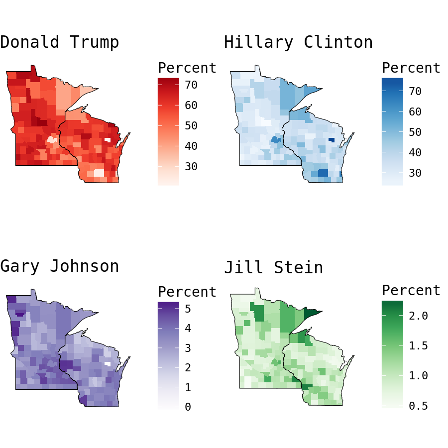
Mapping the allocation of votes by county shows Wisconsin and Minnesota have very similar county-level maps. Each has strong results favoring Clinton in major metropolitan areas, including Milwaukee, Madison, and Minneapolis/St Paul. Based solely on each state’s map, I’d posit that Minnesota seems the more likely Trump-majority. This perspective is deceiving though, as the distribution of votes by county is skewed. Each map displays the percent of votes for each candidate by county, neglecting the county’s total votes. More than 78 percent of Menominee County, WI voters selected Hilary Clinton, resulting in Northeastern Wisconsin’s dark blue polygon, but totaled only 1279 votes.
Lets break this down further by exploring the allocation of votes by county.
Vote Distributions by County
Focusing on the two major candidates, the two states also have similar vote distributions. Each of these figures displays the percentage of votes for Donald Trump (red) and Hilary Clinton (blue), with each bubble sized by percentage of total state vote, organized by the percentage of votes for Donald Trump.
minnesota <- subset(minnesotawisconsin, st=="MN")
minnesota$votePct <- (minnesota$votes/sum(minnesota$votes)) * 100
minnesota <- minnesota %>% arrange(desc(votes))
vals = minnesota[ minnesota$cand == 'Donald Trump', ]
minnesota$county <- factor(minnesota$county, levels = rev(vals$county))
minnesotaSubset <- subset(minnesota, cand %in% c("Donald Trump", "Hillary Clinton"))
mnScatter <- ggplot(minnesotaSubset, aes(county, votePct,color = cand)) +
  geom_point(aes(size = votes)) +
  scale_y_continuous(limits=c(0,15)) +
  theme_tufte(base_family = "DejaVu Sans Mono") +
  scale_color_manual(values = c("red3", "navyblue")) +
  scale_size_continuous(guide = FALSE) +
  labs(title = "Percentage of Total Votes Cast for Clinton and Trump By County",
       subtitle = "Minnesota",
       y = "Total Vote Percentage",
       x = NULL) +
  theme(axis.text.x=element_blank(),
        axis.ticks.x=element_blank(),
        legend.title = element_blank(),
        plot.title =  element_text(size = 16),
        plot.subtitle =  element_text(size = 13))

wisconsin$votePct <- (wisconsin$votes/sum(wisconsin$votes)) * 100
wisconsin <- wisconsin %>% arrange(desc(votes))
vals = wisconsin[ wisconsin$cand == 'Donald Trump', ]
wisconsin$county <- factor(wisconsin$county, levels = rev(vals$county))
wisconsinSubset <- subset(wisconsin, cand %in% c("Donald Trump", "Hillary Clinton"))
wiScatter <- ggplot(wisconsinSubset, aes(county, votePct,color = cand)) +
  geom_point(aes(size = votes)) +
  scale_y_continuous(limits=c(0,15)) +
  theme_tufte(base_family = "DejaVu Sans Mono") +
  scale_color_manual(values = c("red3", "navyblue")) +
  scale_size_continuous(guide = FALSE) +
  labs(subtitle = "Wisconsin",
       y = "Total Vote Percentage",
       x = "County (ordered by Total Vote Percentage\n for Donald Trump (smallest to largest))") +
  theme(axis.text.x=element_blank(),
        axis.ticks.x=element_blank(),
        legend.title = element_blank(),
        plot.title = element_text(size = 20),
        plot.subtitle = element_text(size = 13))

grid.arrange(mnScatter,wiScatter,ncol=1)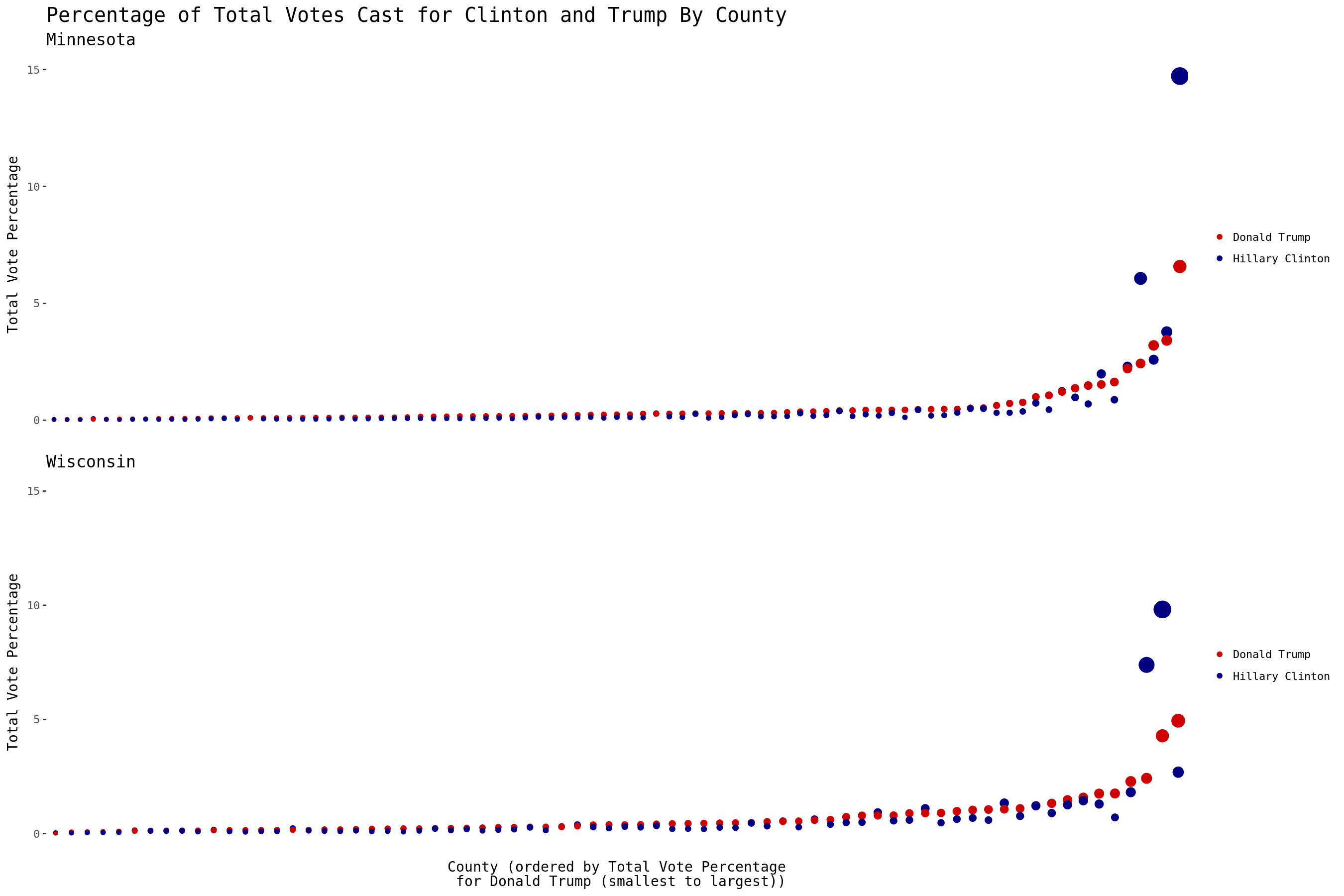
Two things of note from these figures:
- The county with Minnesota’s most votes significantly backed Clinton over Trump (14.7% and 6.6% of the total votes cast in the state respectively). Meanwhile, the top-voting Wisconsin’s county also garnered significant support for Clinton over Trump, but contributed only 9.8% and 4.3% of the total votes cast in the state respectively.
- Trump earned more votes than Clinton in 7 of Wisconsin’s 10 largest counties, including Waukesha - the third largest (4.9% and 2.7% of the total votes cast in the state respectively). Only 4 out of the top 10 most populous counties in Minnesota favored Trump.
The above figure seems to imply that the counties with larger populations in each state had a significant impact on each state’s victor; while most Wisconsin counties favored Trump, most Minnesota counties favored Clinton. Perhaps different levels of urban density might result in a better explanation?
The 2010 Census breaks up metropolitan areas into segments: small, medium, and large. An area must have a population of at least 50,000 to be considered an urbanized metropolitan area, and is further separated if it’s population is greater than 250,000. For this analysis, small metropolitan areas consist of those ranging in population from 50,000 to 250,000, while populations greater than 250,000 are combined into one category.
minnesotawisconsin <- all_results %>%
  filter(str_detect(fips, c("^55")) | str_detect(fips, c("^27")))

minnesotawisconsin$urbanClass <- ifelse(minnesotawisconsin$POP_COU < 50000, "Not a Metropolitan Area",
                                 ifelse(minnesotawisconsin$POP_COU > 50000 & minnesotawisconsin$POP_COU < 250000,
                                        "Small Metropolitan Area","Medium to Large Metropolitan Area"))
# Quick idiot check to make sure our ifelse statement didn't go awry
table(round(minnesotawisconsin$POP_COU,-5), minnesotawisconsin$urbanClass)
##
## Medium to Large Metropolitan Area Not a Metropolitan Area Small Metropolitan Area
## 0 0 920 0
## 1e+05 0 0 241
## 2e+05 0 0 69
## 3e+05 9 0 0
## 4e+05 16 0 0
## 5e+05 16 0 0
## 9e+05 7 0 0
## 1200000 9 0 0After a quick table to ensure correct recoding of urban classification, I grouped the data by candidate, state, and urban classification to better isolate the voting distributions.
minnesotawisconsin$urbanClass <- factor(minnesotawisconsin$urbanClass,
                                        levels = c("Medium to Large Metropolitan Area", "Small Metropolitan Area", "Not a Metropolitan Area"))

mnwiUrban <- minnesotawisconsin %>%
  filter(cand %in% c("Donald Trump", "Hillary Clinton", "Gary Johnson", "Jill Stein")) %>%
  mutate(cand = factor(cand, levels = c("Donald Trump", "Hillary Clinton", "Gary Johnson", "Jill Stein"),
                       labels = c("Trump", "Clinton", "Johnson", "Stein"))) %>%
  group_by(cand, st,urbanClass) %>%
  summarise(sumVotes = sum(votes), population = sum(POP_COU))

mnwiUrban <- mnwiUrban %>%
  group_by(st, urbanClass) %>%
  mutate(percent = sumVotes/sum(sumVotes))

mnwiUrban$st <- factor(mnwiUrban$st, levels = c("MN", "WI"), labels = c("Minnesota", "Wisconsin"))

p <- ggplot(mnwiUrban, aes(cand, sumVotes,fill = cand))  +
  geom_bar(stat = "identity", alpha = 0.8) +
  facet_grid(st ~ urbanClass) +
  theme_tufte(base_family = "DejaVu Sans Mono") +
  scale_fill_manual(values = c("red3", "navyblue", "#6A51A3","darkgreen")) +
  theme(legend.position="none",
        strip.text.x = element_text(size = 12),
        strip.text.y = element_text(size = 14),
        plot.title =  element_text(size = 16)) +
  geom_text(aes(label=paste0(round(percent,3)*100,"%")), nudge_y = 50000,family = "DejaVu Sans Mono") +
  labs(title = "Distribution of Votes Cast in Minnesota and Wisconsin Counties By Urban Classification", y = "Number of votes", x = NULL) +
  scale_y_continuous(limits=c(0,1000000))

## Add in some annotations - since we're facetting we need to make a dummy data.frame with the same factor levels and plot positions as those used in the figure
anns <- data.frame(cand = factor("Gary Johnson", levels = c("Donald Trump", "Hillary Clinton", "Gary Johnson", "Jill Stein"),
                                 labels = c("Trump", "Clinton", "Johnson", "Stein")),
                   st = factor("MN", levels = c("MN", "WI"), labels = c("Minnesota", "Wisconsin")),
                   sumVotes = 700000,
                   lab = "For each State and Urban Class:\nBar Height - Total Votes\n\n  Percent - Portion of votes",
                   urbanClass = factor("Not a Metropolitan Area",levels = c("Medium to Large Metropolitan Area",
                                                                            "Small Metropolitan Area", "Not a Metropolitan Area")))

## Apply the annotations to the top right facet (i.e. Minnesota, Not a Metropolitan Area). Swoopy arrows are fun!
p + geom_text(data = anns,aes(label =lab), family = "DejaVu Sans Mono", size = 3) +
  geom_curve(data=anns, aes(x=2.1, xend=1.5, y=690000, yend=100000), curvature=0.3, arrow=arrow(length=unit(0.03, "npc"))) +
  geom_curve(data=anns, aes(x=2.4, xend=3, y=580000, yend=110000), curvature=-0.3, arrow=arrow(length=unit(0.03, "npc")))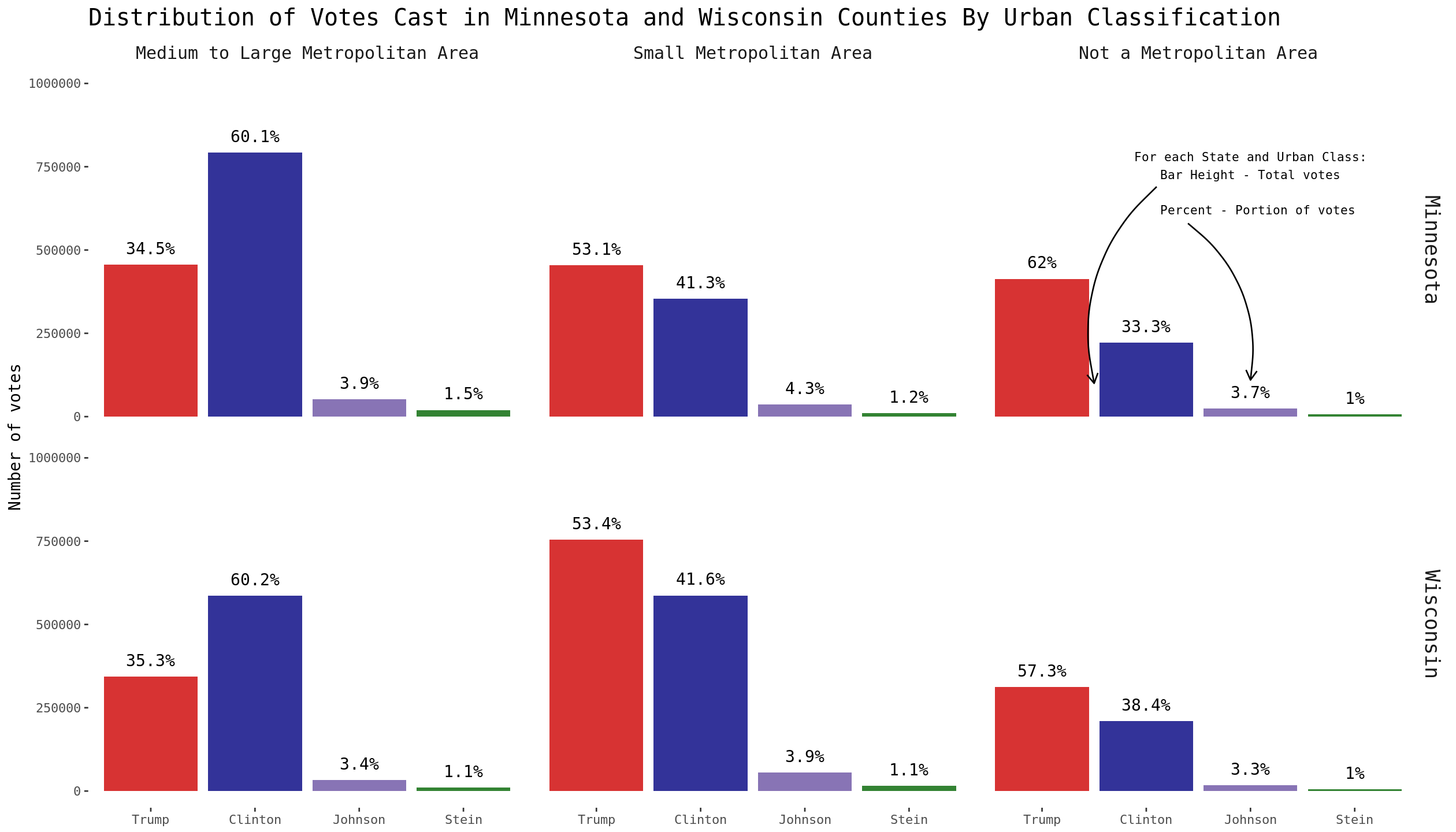
The data shows a sizable rural/urban divide in Minnesota and Wisconsin. Both states voted for each candidate at nearly the exact same rate in medium/large and small metropolitan areas. The major difference is how the population in each state is distributed:
mnwiUrban %>%
    select(st,urbanClass, sumVotes, population) %>%
    group_by(st,urbanClass) %>%
    summarise(total = sum(sumVotes), metroPopulationTotal = unique(population)) %>%
    mutate(stateVoteAllocationByMetro = total/sum(total),
           populationPctByMetro = metroPopulationTotal/sum(metroPopulationTotal),
           votingPctByMetro = total/metroPopulationTotal)
## Source: local data frame [6 x 7]
## Groups: st [2]
##
## st urbanClass total metroPopulationTotal stateVoteAllocationByMetro populationPctByMetro votingPctByMetro
## <fctr> <fctr> <int> <dbl> <dbl> <dbl> <dbl>
## 1 Minnesota Medium to Large Metropolitan Area 1318717 2390461 0.4644240 0.4506966 0.5516580
## 2 Minnesota Small Metropolitan Area 854434 1579726 0.3009134 0.2978409 0.5408748
## 3 Minnesota Not a Metropolitan Area 666317 1333738 0.2346626 0.2514625 0.4995861
## 4 Wisconsin Medium to Large Metropolitan Area 972116 1825699 0.3318823 0.3210310 0.5324624
## 5 Wisconsin Small Metropolitan Area 1411946 2766790 0.4820411 0.4865125 0.5103192
## 6 Wisconsin Not a Metropolitan Area 545037 1094497 0.1860767 0.1924564 0.4979794While the highest portion of votes in Minnesota came from counties defined as medium and large metropolitan areas (46.4%), those defined as small metropolitan areas contributed the most votes in Wisconsin (48.2%). These voting distributions match up nicely with the percentage of each state’s population by metropolitan area, as seen in the two variables stateVoteAllocationByMetro and populationPctByMetro - these distributions contributed to the outcome of each state’s election. The rate at which different types of urban areas supported a particular candidate is nearly identical between Minnesota and Wisconsin.
Conclusion
While there are major differences in how rural and urban voters supported particular candidates, this division is not unique to states that cracked the “Midwestern Blue-State Firewall” in the 2016 presidential election. In Minnesota and Wisconsin, larger metropolitan areas voted strongly in favor of Clinton, while smaller and non-urban areas strongly favored Trump. Further exploration is necessary to make more granular conclusions, but in these two states the differing distributions of populations into small and medium/large metropolitan areas may help explain each candidate’s victory.
Next Steps
Data with eligible-voter populations and demographic information at the county level might further supplement this exploration by providing a more detailed picture of rural and urban voters beyond raw population and vote totals. Outlets such as FiveThirtyEight have used this type of granular data to inform predictive forecasts of elections. Thoughts or questions about the post? Contact me on twitter.